In my first year of Communication and Multimedia Design (CMD), I worked with a group of four students to design Easy Recepy. This is a recipe app created specifically for people aged 40-60. The app is simple and easy to use, tailored to the needs of this age group.
I focused on designing the interfaces and making the app user-friendly with a clear design. By testing the app with people from the target audience, I gained valuable feedback. These insights helped me improve the design.
Read on to learn more about the key design choices we made!
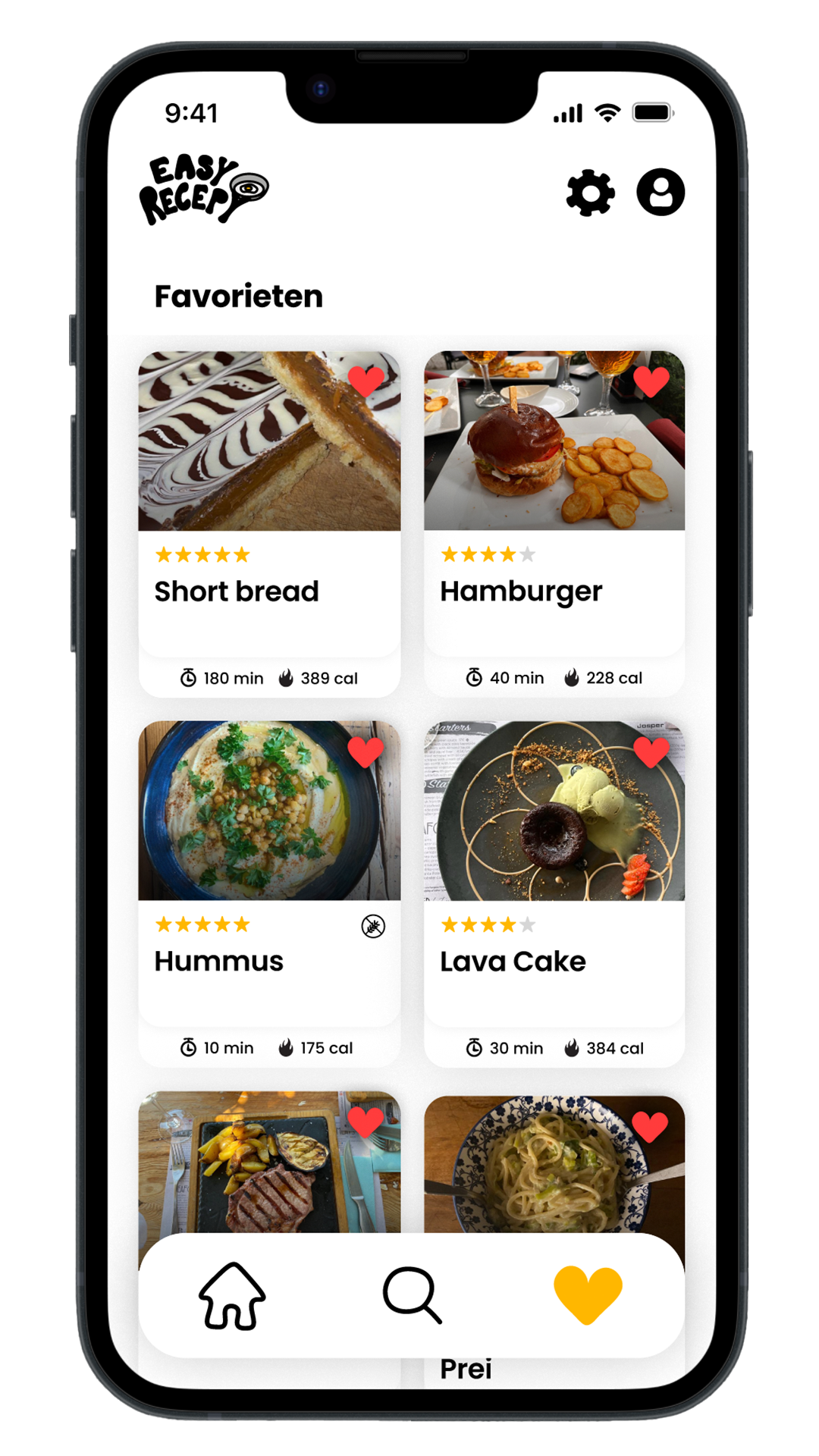
Since the target audience is 40-60 years old, we kept the design minimalistic to make it easy to understand and free from distractions. The navigation bar allows users to quickly switch between Home, Search, and Favorites. These are the only pages needed to find and save recipes.
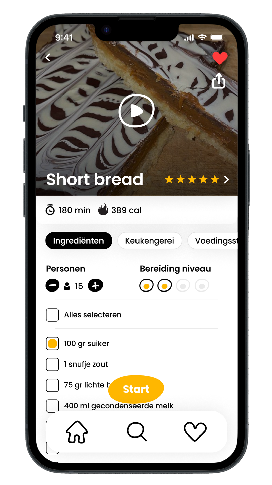
We used clear icons to organize and structure the screens, such as preparation time and calories. Information is divided into different sections like Ingredients, Tools, and Nutritional Values. This helps keep the information simple and not overwhelming for the user.
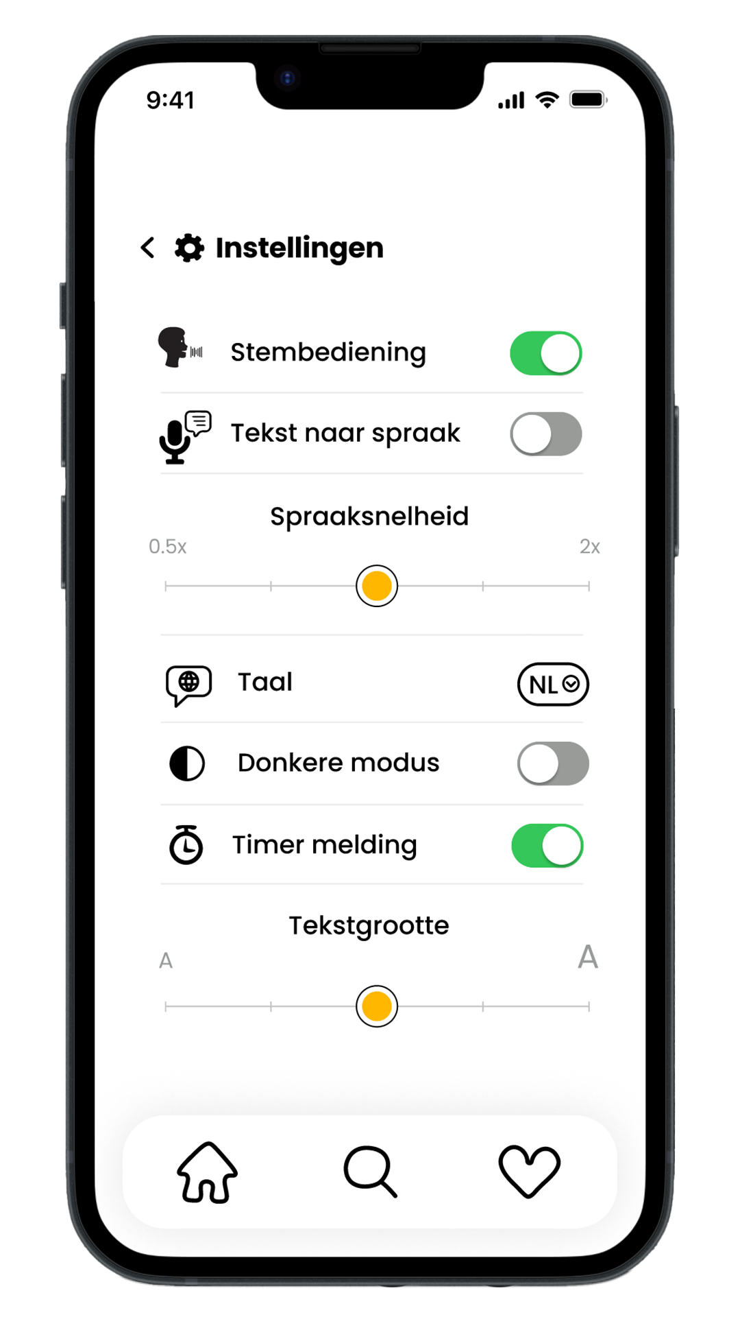
We focused on the app’s usability and accessibility. For situations where users have dirty hands or can’t use their hands, we added voice control. We also included text-to-speech for visually impaired users, with options to adjust the speech speed, change the language, enable dark mode, turn timer notifications on or off, and adjust the text size.
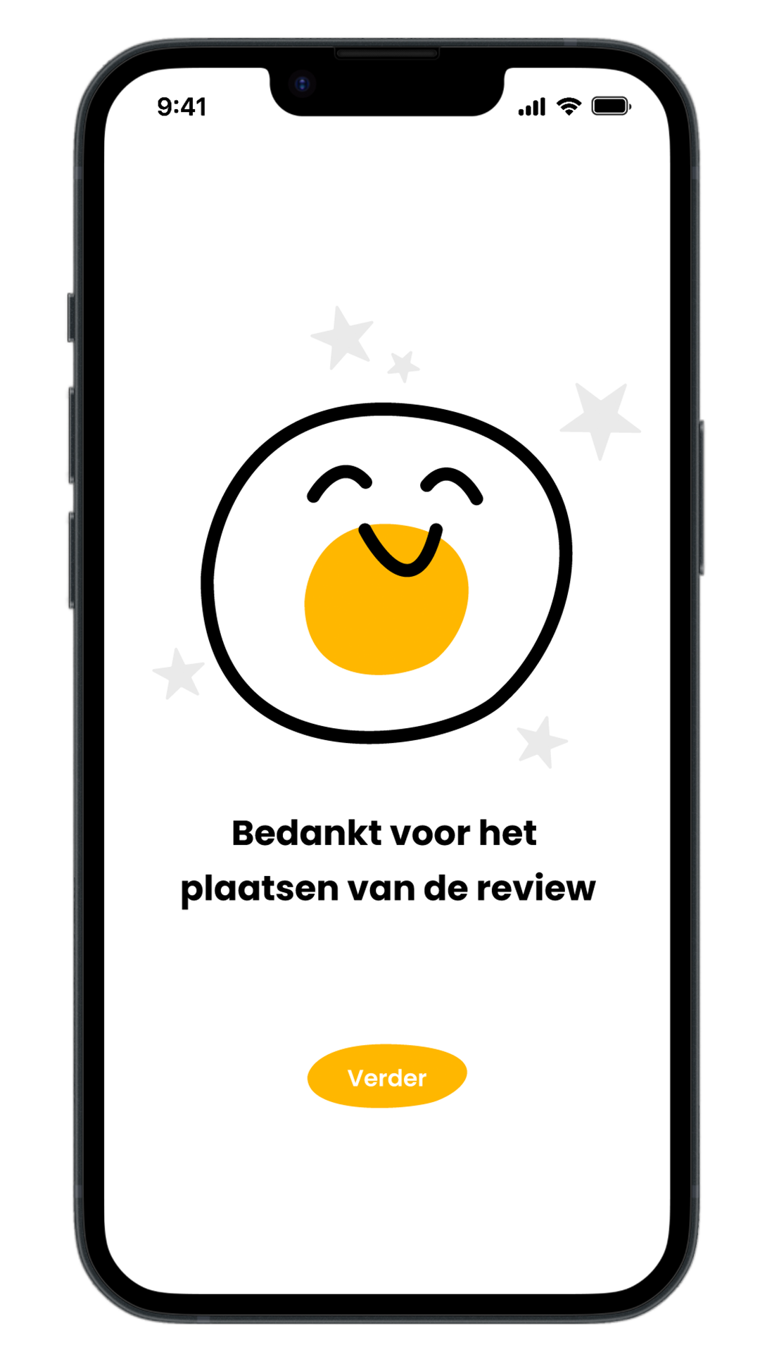
We believe it’s important for our cooking app to have a cheerful and inviting look. That’s why we added playful illustrations throughout the app. These not only make the app more visually appealing but also create a positive and enjoyable experience.