← All Projects
Web Design · UX/UI · 2025
Golden
Roast
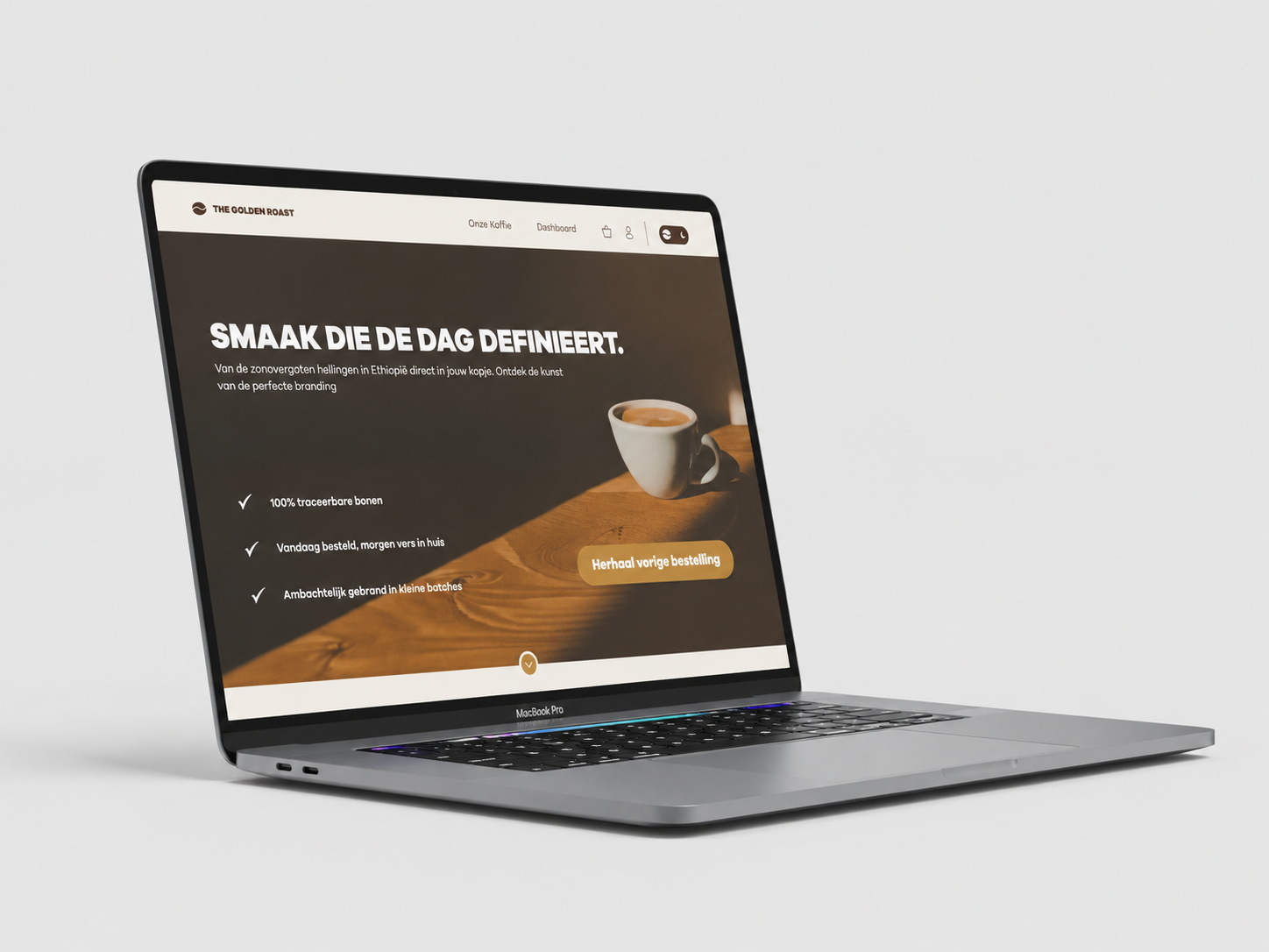
The design was built around persona Mark, a regular coffee drinker with a fixed routine. He is not a coffee expert, but knows what he likes and wants to reorder it quickly without having to search.
The interface supports this through quick actions on the dashboard, such as reordering a previous blend, while still offering room to explore new products.
A moodboard was created using premium coffee brands, natural materials, and calm interfaces. The direction focused on warm earthy tones, organic textures, and a refined visual identity that matches persona Mark and his daily routine.
A 12-column grid with 144px margins and 24px gutters was used to create consistent spacing and a high-end feel. The hero section was structured using a Z-pattern to guide the eye directly towards the main CTA: reordering a previous blend.
The 60:30:10 rule was applied throughout the design. Oat Milk forms the light base, Roasted Bean adds warmth to surfaces, and Warm Caramel is used as the accent color on buttons and key interactions. Auto Layout and components were used in Figma to keep everything consistent.
Two color palettes and two layout directions were tested before reaching the final design. A day and night mode were developed, with the night mode using a darker base to reduce screen harshness and shift focus to actions like the taste radar and favorite blends.
Galano Grotesque
Clean and readable typography supports both branding and usability. The hierarchy guides the eye from headline to CTA, keeping content easy to scan.
The final design combines branding and usability into one consistent experience. The landing page focuses on storytelling and product presentation, while the dashboard is built around personalization and quick actions. This includes a loyalty system, taste radar, favorite blends, and a reorder button that lets Mark get his coffee in seconds.
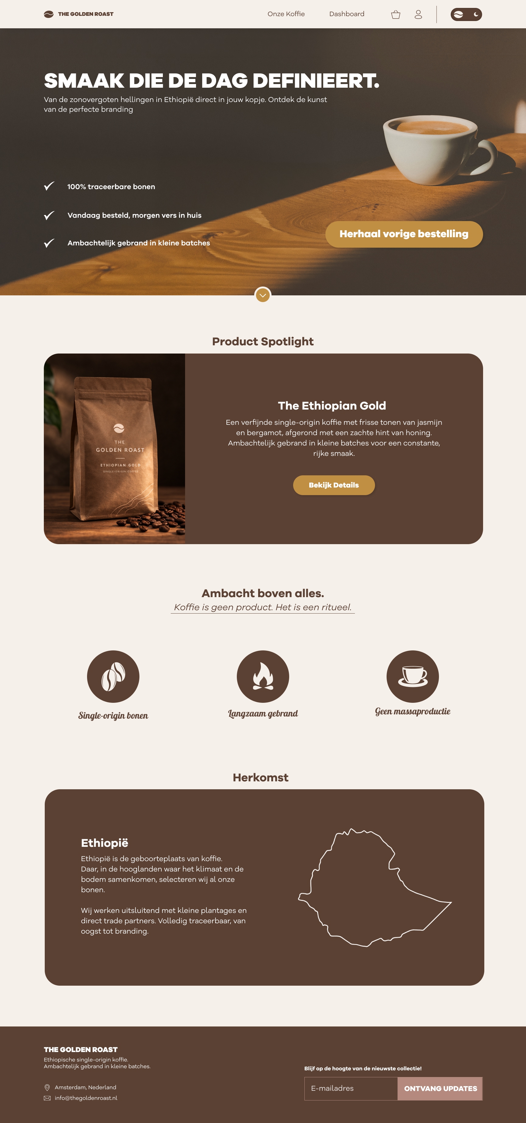
Landing Page
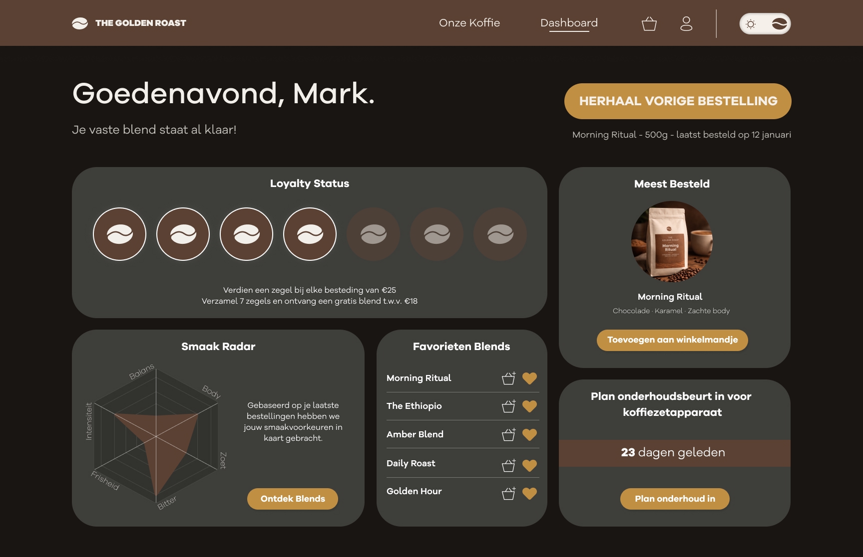
Dashboard