← All Projects
Graphic Design · 2025
Dune Book Cover
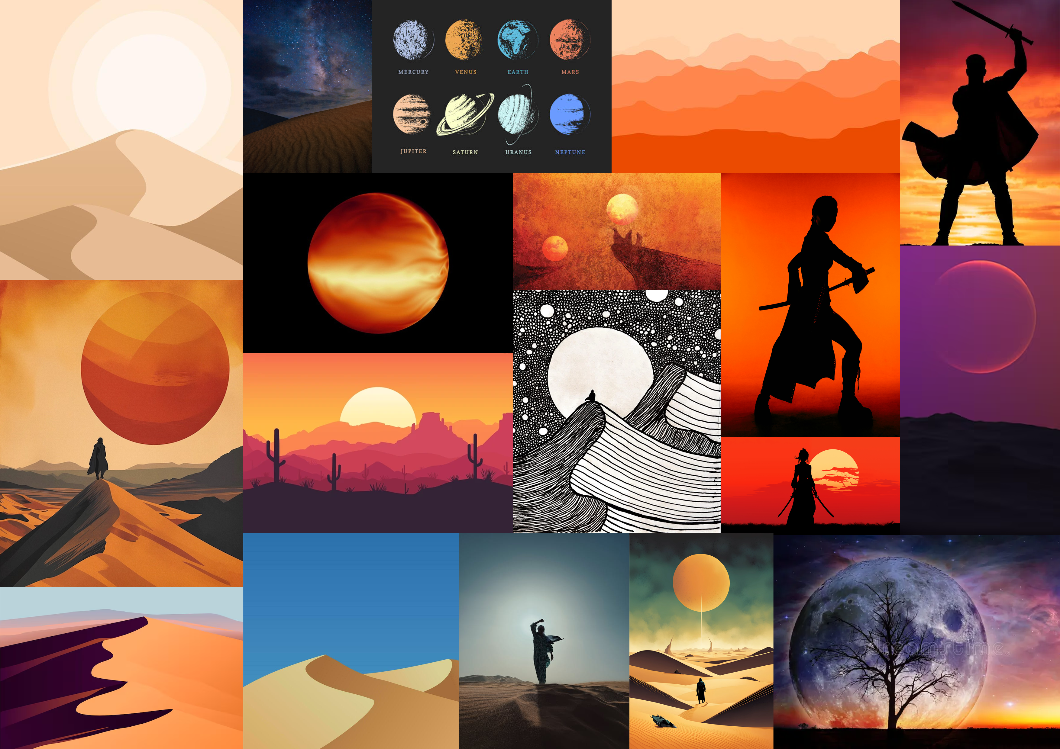
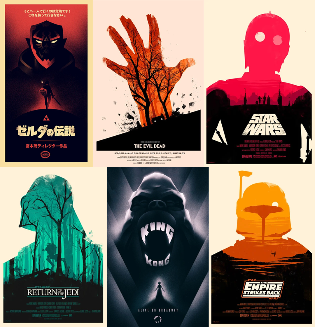
I analysed existing sci-fi book covers and identified what makes them effective. Silhouettes, gradients, bold typography, and negative space appeared as recurring elements.
I explored the key visual themes of Dune, such as dunes, planets, the night sky, and isolation. A colour palette emerged early, with warm orange tones for the desert and deep blue and black for space.
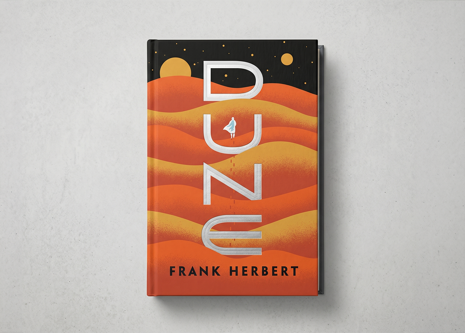
Six initial concepts explored different directions: negative space within a letter, oversized type integrated with dune shapes, silhouettes containing a planet, and abstract geometric forms.
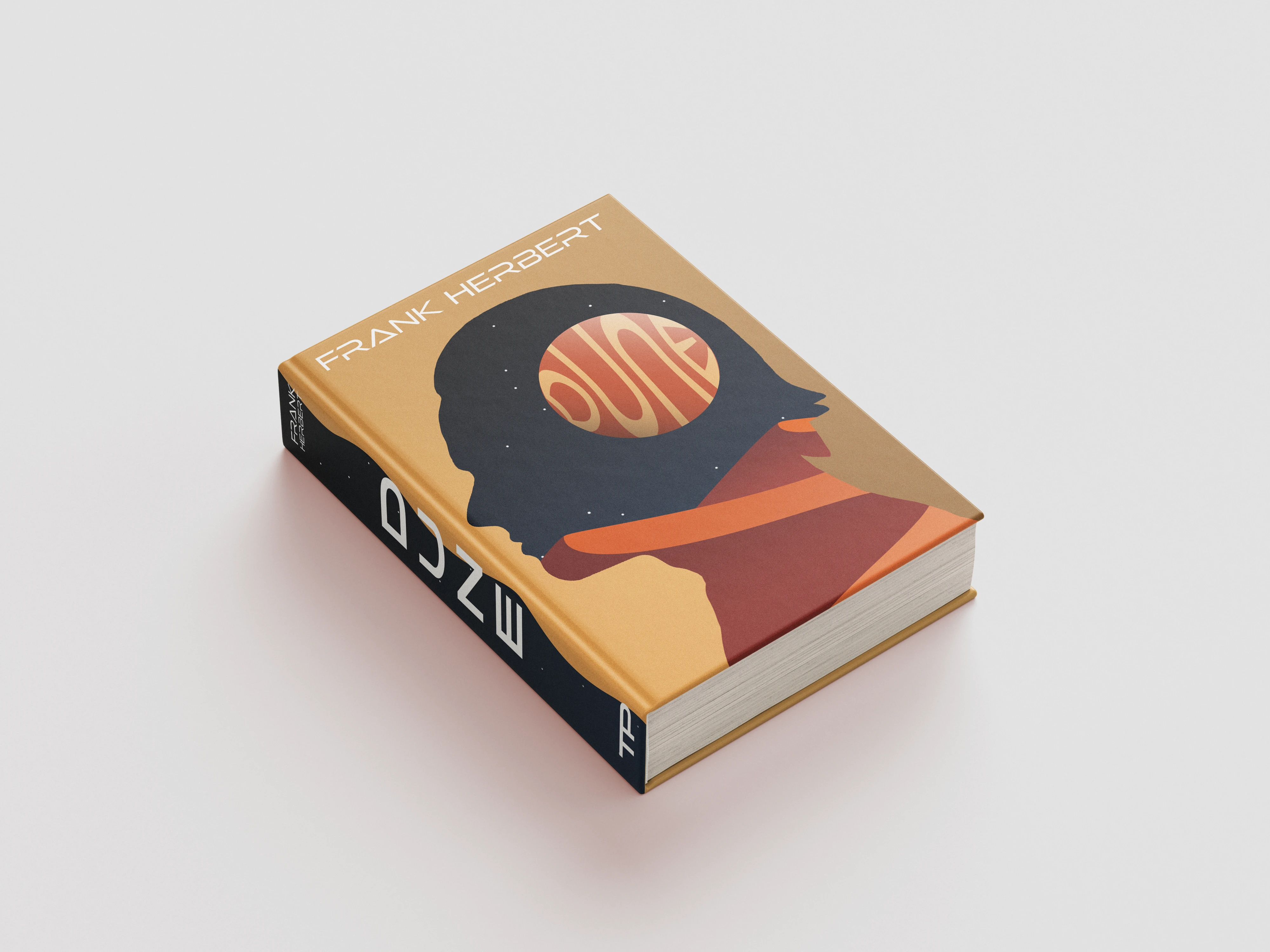
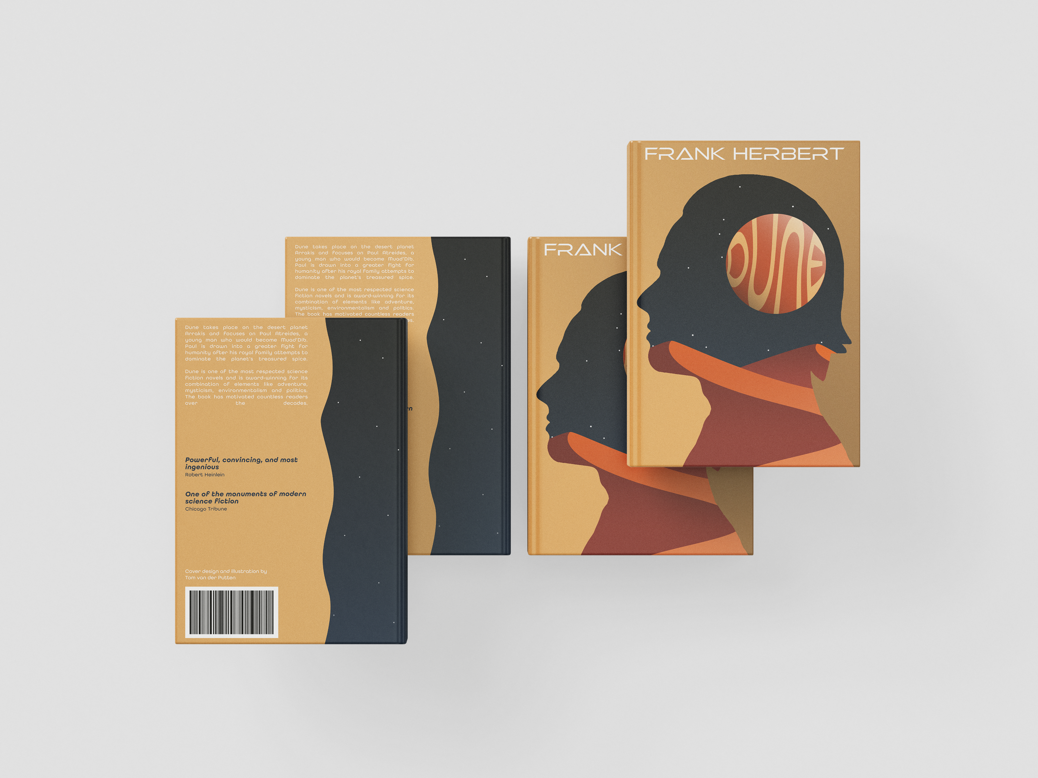
Two stood out: a profile silhouette with a scene inside the head, and typography that blended directly into the dune landscape. Both relied on scale to tell the story.
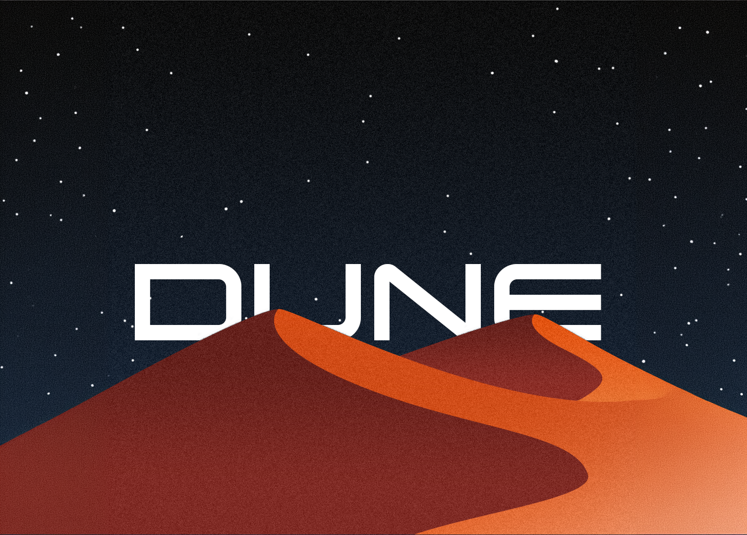
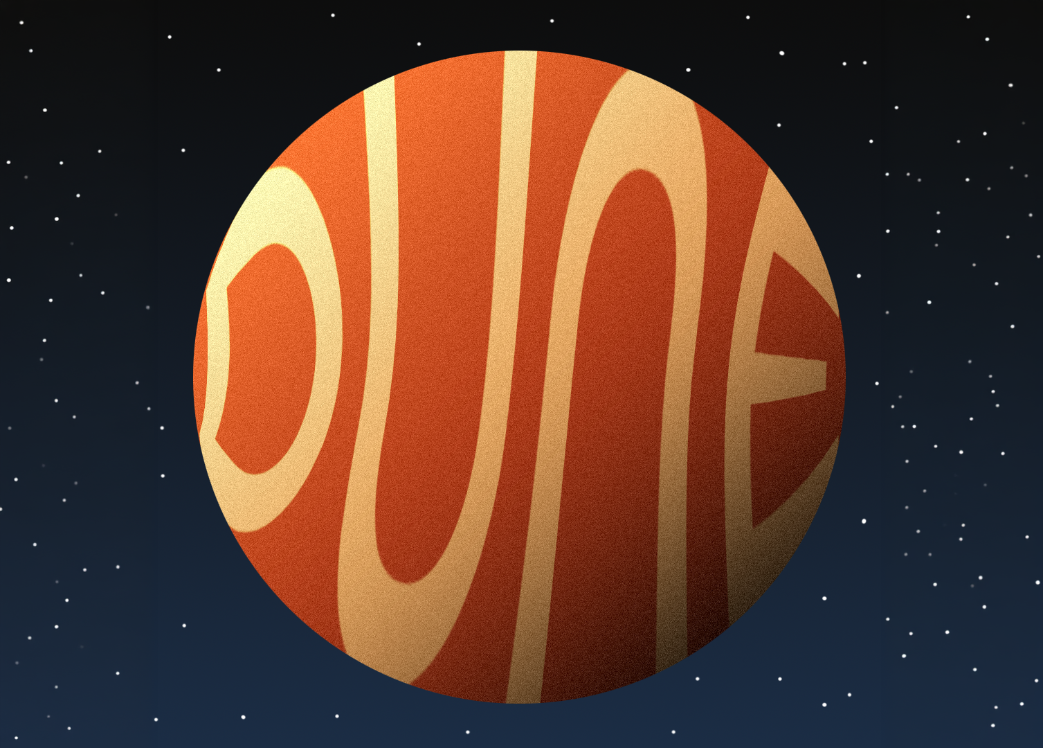
I worked on each element separately: the planet, the dune shapes, the typography, and the silhouette. Then I brought them together and kept refining the composition.
For the silhouette, drawing in Photoshop created hard edges I wasn't happy with. I photographed two friends in profile and refined the cutouts with the smoothing brush. The result had the organic, cinematic quality the design needed.
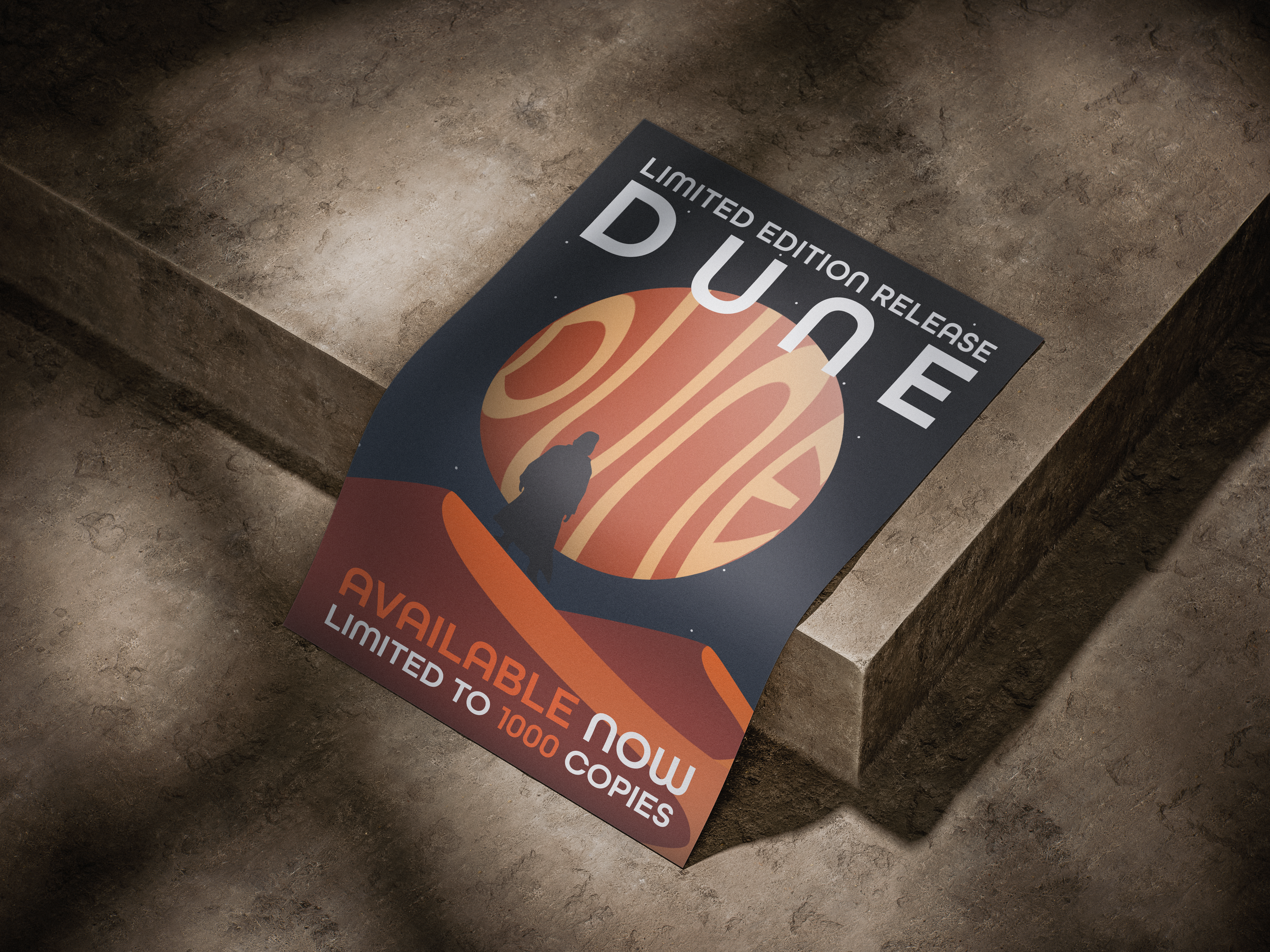
Limited edition promotional poster
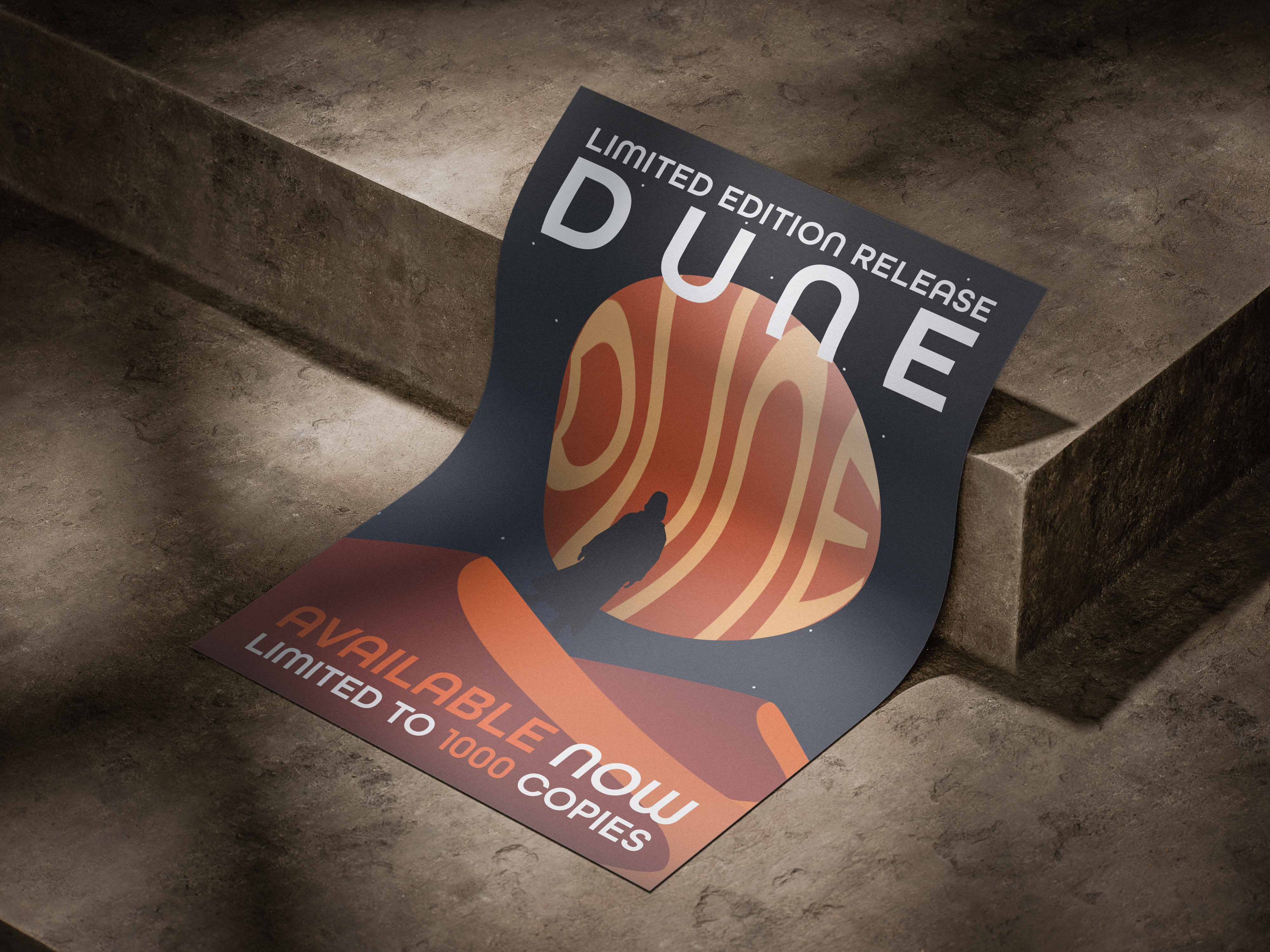
What started as a design brief became a study in restraint. The strongest version of the cover was always the one with the least: no texture overlays, no character detail, no decorative elements. Just shape, colour, and space.
The project reinforced that good design communicates clearly. Negative space can say more than a detailed illustration ever could. The viewer completes the story themselves.